Those with an eye for graphic design might soon notice the addition of a blue heron in flight to the Town of Barrhead’s logo in certain circumstances.
During the Town of Barrhead council meeting on Nov. 24, communications co-ordinator Jennifer Pederson brought forward a proposal to add the blue heron to sponsorship advertisements, letters, documents and other materials, particularly when the town is a partner in an event with other organizations.
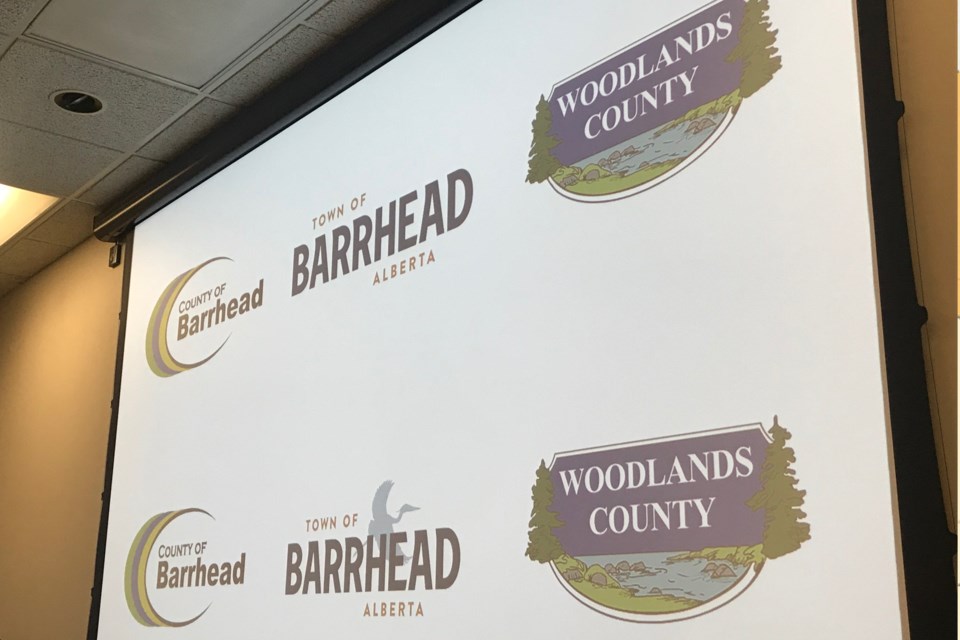
Pederson noted the town had embarked on a re-branding exercise in late 2019 with the intention of creating a brand “that reflected the strength of the community.”
As part of that exercise, a firm called Ion Brand Design came up with a new logo, typeset, colours and pattern sets for the town’s use.
At the Nov. 10 meeting, town council opted to forego the use of a “Grow Your Own Way” slogan in conjunction with the new brand, which Pederson acknowledged was a very strong product on its own.
However, “there have been some concerns regarding the new logo’s ability to stand out in situations when it is used in partnership with other organizations,” she said.
For that reason, she recommended adding a blue heron in flight when the brand appears in places where none of the other elements developed by Ion (ie. patterns, colours, typography) are being used.
Coun. Leslie Penny asked why they would use a blue heron in flight when the town’s official logo typically depicts a standing bird.
Pederson said the flying heron stays in line with the branding created by Ion and also creates a sense of movement.
Coun. Rod Klumph said he also wondered why a stationary bird wasn’t used, but reasoned that it might be mistaken for another letter in the logo.
Coun. Dausen Kluin said he liked the addition of the bird but suggested that a lighter shade be used, as a darker colour made the town’s logo hard to see.
Ultimately, council passed a motion to go along with administration’s recommendation to add the blue heron in situations where the other branding elements aren’t present.
Any costs associated with updating the logo have already been absorbed into the 2021 budget, Pederson noted.